|
P&L Graphs
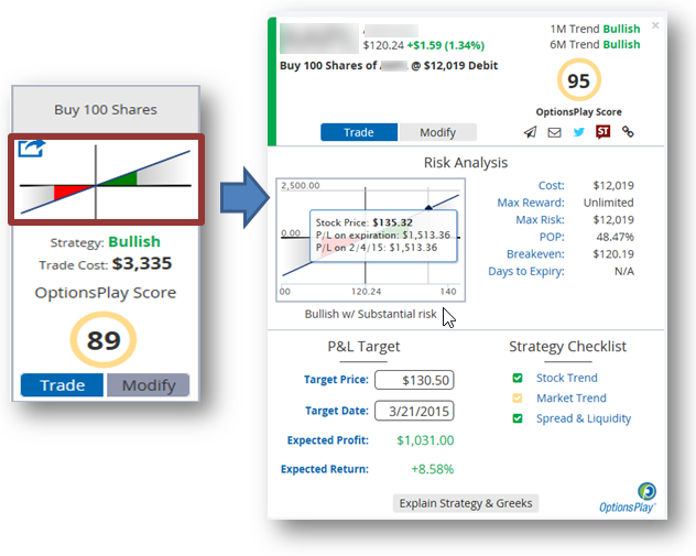
- These Graphs illustrate the profit and loss curve of the trade. The area above the horizontal axis is profit. The area below is loss. The intersection of the vertical and horizontal axes is the current price of the stock. The area to the right of the vertical line depicts upward price movement. The area to the left is downward price movement. You can see how the profit(green) or loss(red) increases or decreases with the stock's movement in either direction.
- You can click on the P&L chart to see expanded view of the chart and if you mouse over the chart you will see how the P&L for the day and for expiration day changes with stock price's movement
- You can see the following information as well as the Delta and the Vega Greeks explained in Plain English:
Cost: This is the net Debit/Credit for the Trade using the current Bid/Ask quote.
Max Reward – Of the entire strategy
Max Risk – Of the entire strategy
POP: Probability of Profit - this is the probability of the strategy having at least $0.01 in profit at the time of expiration. Example : if a Long Call has a breakeven of $35.00. Then POP is essentially the probability of theStock being above $35 on expiration date.
Breakeven: This is the breakeven(s) of the strategy.
Days to Expiration.
- The Options Play Score is an indicator evaluating the strategy and informing you whether the level of risk you are taking is appropriate for the reward you may receive. An Options Play score below 100 means you are potentially taking too much risk. Note: Adjusting the expected trading range of the stock may adjust the score.
|